News
The race pace band that turns a race into a visible plan
A complete guide to calculating splits and keeping a clear reference during any race.

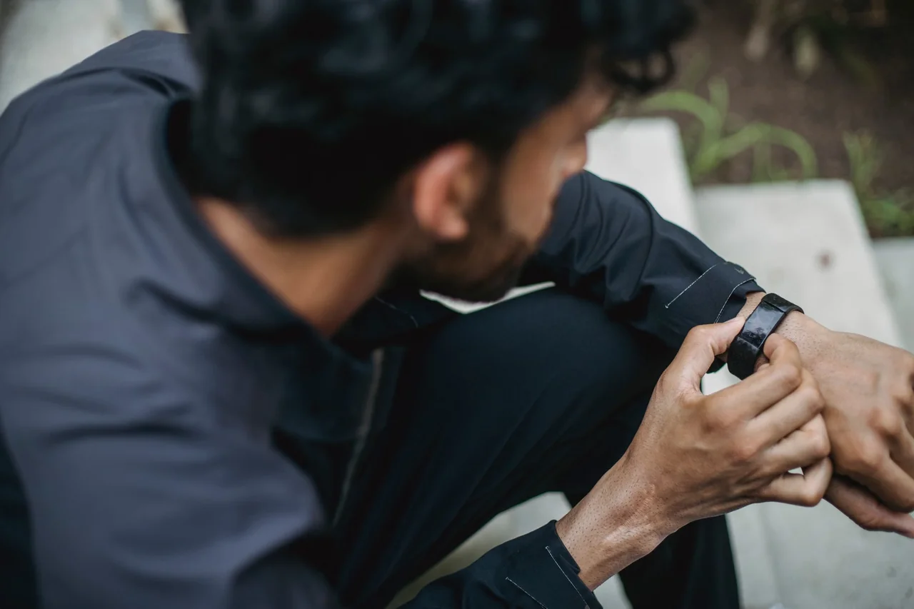
Imagen: Ketut Subiyanto / Pexels
A strip of paper with cumulative times may seem like a modest resource compared with a GPS watch, but during a race it offers something decisive: an immediate, stable and easy-to-interpret reference. The runner knows what time should be displayed when passing each kilometer and can compare that figure with the stopwatch without navigating menus, waiting for the satellite to update the distance or interpreting an ever-changing instant pace.
This tool is especially useful in 5Ks, 10Ks, half marathons and marathons, although it can also be adapted to any distance. It is prepared from a finishing goal and a specific strategy, printed in a narrow format and placed on the wrist or forearm. The key is not to follow it blindly, but to use it as a compass for managing effort when the noise of the race makes it difficult to think clearly.
What exactly is it and what information does it contain?
The traditional format is a paper band showing the race kilometers together with the expected cumulative time. If the goal for a half marathon is to finish in 1 hour and 45 minutes, the table might indicate 4:59 at the first kilometer, 9:58 at the second and 14:57 at the third, with small variations resulting from the official distance of 21.097 kilometers. It is not just about displaying an average pace: what matters is knowing when each split should appear.
Some versions also include the pace per kilometer, splits every 5 kilometers or an estimated finishing time. Others leave space for noting aid stations, inclines, strategy changes or distinctive points along the route. In an urban race, where there may be tunnels, tall buildings and large groups, a printed table provides an independent reading that is unaffected by common GPS measurement errors.
It is useful to distinguish between cumulative time and the time for the latest segment. The former reflects the overall situation in the race: if, upon reaching kilometer 10, the watch shows 49:50 and the band indicates 50:00, there is a favorable margin of 10 seconds. The latter makes it possible to analyze the pace of that specific kilometer. To make decisions during a long race, cumulative time is usually more useful and less erratic than instant pace.
How to turn a finishing goal into realistic splits
The basic calculation starts by dividing the total time by the distance. A goal of 50 minutes for 10 kilometers equals 5:00 per kilometer. In a 5-kilometer race with a goal of 25 minutes, the reference is the same. By contrast, a 1:45:00 half marathon requires approximately 4:58.6 per kilometer, because the official distance is not exactly 21 kilometers. In a 3:30:00 marathon, the actual average is close to 4:58 per kilometer to cover 42.195 kilometers.
Rounding should be done carefully. A table marking exactly 5:00 at every kilometer of a half marathon would finish at 1:45:29, not 1:45:00, because of the additional 97 meters. That difference may seem irrelevant at first, but it adds up. For this reason, a pace and time calculator helps avoid errors and generate a table adjusted to the official distance, the goal and the chosen units. Running Valencia’s pace and time calculator serves as a starting point for reviewing these conversions.
The result should not be confused with a guaranteed prediction either. The finishing time depends on elevation gain, wind, temperature, turns, crowds and the ability to maintain the effort. A figure calculated for a flat route may not be appropriate for a hilly course. In that case, the wristband should reflect a sensible expectation, not a mathematical fantasy. Arithmetic organizes the plan, but the course determines how it is executed.
Even pace, a cautious start and a faster second half
The simplest strategy is to run every kilometer at a similar pace. It works best on flat courses, with predictable weather conditions and a runner who knows their ability well. The table shows a regular progression and helps detect a start that is too fast. In the first few minutes, when freshness and the group’s enthusiasm push runners forward, this reference acts as a small tactical brake.
Another option is to start slightly below average pace and accelerate later. This distribution, known as a progressive second half, can reduce the risk of early exhaustion in a half marathon or marathon. For example, when aiming for 3:30 over 42.195 kilometers, a cautious strategy might place the first half near 1:45:30 and reserve the acceleration for after kilometer 30, provided the sensations are good. In that case, the band should show the split times for the chosen strategy, not just a uniform division.
It is also possible to prepare a reference by blocks. In a 10-kilometer race, the first 3 kilometers may be approached in a controlled manner, the next 5 at goal pace and the final section according to physical condition. Although the printout may show a continuous table, the runner can visually mark these changes with discreet lines or colors. The advantage is mental: instead of trying to solve the entire race at once, the runner focuses on the section at hand without losing sight of the overall result.
The difference between pace, time and effort
Pace expresses how long it takes to cover a unit of distance, usually minutes per kilometer. Cumulative time indicates how much time has elapsed since the start. They are related figures, but not equivalent. A runner may have an average pace of 5:00 per kilometer and, due to a stop or a congested area, be a few seconds behind the expected time. The band shows that deviation; the body and the course help determine whether it is worth correcting.
On an uphill section, maintaining the same numerical pace may require a disproportionate effort. On a gentle downhill, pace may improve without intensity increasing too much. For this reason, a rigid table is less suitable for trail running, courses with significant elevation changes or hot days. In those situations, the goal should be interpreted together with breathing, heart rate, power when available and subjective sensation. Effort is the main variable; the printed number is a guide.
In road races with a consistent profile, cumulative time remains highly useful. Kilometer signs, official markers and the watch form a checking system, although they rarely coincide to the second. Curves and each participant’s trajectory may cause the GPS to record more distance than the certified course. The prudent approach is not to accelerate suddenly because of a minimal difference, especially during the first kilometers.
How to design a band that can be read while moving
Legibility matters as much as accuracy. A strip that is too narrow, with small numbers or poor contrast, loses its function when the runner is breathing heavily and the light changes. Black on a white background is usually the clearest combination. It is preferable to show less information in a larger size than to fill the paper with tiny columns. The essential data should be distinguishable in a fraction of a second: kilometer, cumulative time and, if desired, expected pace.
For a short race, one line per kilometer may be enough. In a marathon, the amount of data increases, and it is advisable to reduce the visual load by grouping splits every 5 kilometers, without removing intermediate markers if the runner needs them. A balanced solution is to alternate every kilometer with more prominent figures at 5, 10, 15, 20, 25, 30, 35 and 40. This makes orientation easier without turning the wrist into a miniature spreadsheet.
The paper should withstand sweat, light rain and rubbing against clothing. A standard printout can be protected with transparent adhesive tape, a thin cover or lamination that does not create excessive glare. Leave enough margin to fold and secure it without covering the numbers. It is also worth checking that the ink does not smudge and that the band retains its shape when wet. These details are best tested during a long workout rather than at the starting line.
Where to place it and how to consult it without disrupting the race
Many runners wear it on the wrist opposite their watch so they can compare the actual time with the goal at a glance. Others place it on the forearm, where there may be more space and less movement. There is no universal position: it should remain secure, not restrict circulation and allow the text to be seen without turning the arm excessively. The fastening system should not cause chafing either, a minor annoyance at first that can become a problem after several hours.
It should be checked at natural moments, such as when passing a kilometer sign or after an aid station. Looking at it constantly can increase tension and lead to chasing seconds that do not matter. If the watch reads 24:52 at kilometer 5 and the reference says 25:00, there is no need to accelerate immediately. That margin may disappear on a curve, a narrow section or during a brief stop. The table helps interpret the race, not run with your eyes glued to the numbers.
A trial run makes it possible to decide which information is unnecessary. During a pace session or a long run, you can check whether the type is easy to read, whether the band shifts and whether the runner understands the splits without stopping. You can also rehearse using the same watch, shirt and hydration system that will be used on race day. Familiarity transforms a strange object into an automatic reference.
What to do when the actual time does not match
Small differences are normal. In a crowded start, several seconds may be lost before crossing the line, and during the first meters it is common to run along a less direct path. If the delay is 5 or 10 seconds, it is usually better to spread the correction over several kilometers. Trying to recover it in a single section increases the effort and may exact an early price, especially over distances of 21.097 or 42.195 kilometers.
If the runner is ahead, the reaction should not be to accelerate further either. An excessively fast start can cause damage that does not appear until the second half. In a marathon, a few seconds gained before kilometer 10 are less valuable than saving energy for the section between kilometers 30 and 35. The band makes it possible to detect that excess and return to a controlled pace before the feeling of ease disappears.
When the difference is large, the cause should be reviewed. It may be due to a distance measured incorrectly by the watch, a marker placed a few meters before or after the actual point, a stop to drink or a deliberate change because of a hill. If the body shows signs of fatigue, dizziness, sharp pain or unusual difficulty breathing, the time goal is no longer the priority. No split justifies ignoring an important physical warning.
The course should also be reflected in the table
A time reference becomes more valuable when it is designed around the actual course. The profile, turns and aid stations explain why an even pace may be unrealistic. On a race with an uphill section between kilometers 6 and 8, for example, a moderate loss may be acceptable, with part of the time recovered later on a more favorable section. Planning stops being a straight line and becomes an interpretation of the terrain.
There are many urban races, half marathons, mountain races and coastal routes in the Valencian Community, with very different conditions. Consulting the popular races map makes it possible to locate the courses and assess whether a conventional table fits the race. On a route with elevation changes, it may be more useful to note references by section than to obsess over each individual kilometer.
The date and distance also influence how the band is prepared. The popular races calendar helps identify the type of competition and anticipate whether there will be heat, humidity, narrow streets or a large field. Preparing a table for a 5-kilometer race on a fast avenue is not the same as preparing one for a marathon with changes of direction and several cheering points. The paper is small, but it should contain the logic of the course.
Common mistakes when calculating and printing times
The most common mistake is confusing minutes and seconds. A pace of 4:50 does not mean 4.50 minutes in decimal format, but four minutes and fifty seconds. It is also common to calculate an average over exactly 21 kilometers and forget the additional 97 meters of an official half marathon. Checking the distance, time format and finishing time before printing prevents a conversion error from accompanying the runner throughout the race.
Another problem is choosing a goal that does not match the available preparation. A calculator can generate a perfect table for 40 minutes over 10 kilometers, but it cannot prove that this pace is sustainable. The goal should be based on recent workouts, comparable results and foreseeable conditions. A slightly conservative reference is usually more useful than an ambitious figure that requires correction from the third kilometer onward.
The final mistake is printing only one version when several reasonable strategies exist. It may be useful to prepare a main table and another that is somewhat more cautious, even if only one is used during the race. That alternative should not become a source of doubt, but rather a way to acknowledge that performance depends on the day. The best band is the one that reduces unnecessary decisions, not the one that brings together the most possibilities.
A simple aid within broader preparation
The wristband does not replace training, rest, hydration or the ability to adjust effort. Its function is more specific: to turn an abstract goal into a visible sequence of times. This translation can be reassuring because it divides a long distance into small milestones, but it does not eliminate the uncertainty inherent in competing. The race still contains variables that no piece of paper can control.
In a training session, the table helps determine whether the expected pace feels sustainable and whether the selected splits are easy to read. In competition, it serves as a backup when the watch loses its signal, records extra distance or displays too many metrics. Its value lies precisely in redundancy: two independent references are more reliable than one when decisions must be made under fatigue.
The resource also makes it possible to observe how the perception of time changes. In a 5K, every second carries significant weight and the reference may be checked frequently. In a marathon, splits take on meaning within a longer-term effort-management strategy, with pauses to drink, temperature changes and moments of fatigue. The same idea takes different forms depending on the distance, the runner’s level and the purpose of the race.
The precision that fits on a strip of paper
A well-calculated time band does not promise a perfect race. It offers something more reasonable: a framework for running wisely. It makes it possible to know whether the initial pace is too fast, whether a difference deserves attention or whether it is best to maintain the effort without chasing the watch. Its simplicity is also its limitation, because it cannot interpret the wind, elevation changes or physical condition; those decisions still belong to the runner.
Preparing it requires few resources, but it does require some attention: knowing the official distance, choosing a realistic goal, calculating the splits, checking the format, protecting the paper and testing it beforehand. Once those steps are complete, checking it during the race becomes almost instinctive. Among screens, alerts and changing data, a small sequence of numbers can restore perspective and serve as a reminder that pace is not merely a figure: it is the concrete way of distributing energy all the way to the finish line.
You may also like: Pace bracelets for racing: a practical guide.



How to prevent thigh chafing: causes and real solutions

Women’s running windbreakers: seven jackets and how to choose

Do more workouts get rid of soreness? A guide for runners

Jaén Half Marathon 2026: Record 3,800 Runners Registered

Men’s short running tights: how to choose the right pair

World Triathlon confirms data breach involving medical data

Izan Edo targets podium at Miyazaki World Cup

María Pérez ranks ninth in World Athletics’ 2026 top ten

Dos Santos, Duplantis and Sawe: World Athlete of the Year finalists

San Silvestre Vallecana 2026: 42,000 places, prices and start times
 Races3 months ago
Valencia Half Marathon 2027: date and registration

 Races3 months ago
Valencia Marathon 2026: entry, ballot and course
 Reviews and Comparisons4 months ago
Asics Gel-Roadmiles 3 for men: review and current price

 Reviews and Comparisons4 months ago
Asics Gel Sonoma 8 Gore-Tex: complete analysis for trail and rain

 Sneakers3 months ago
Saucony Endorphin Pro 4: full review and verdict

 News5 months ago
Strava API 2026: what changes for clubs, challenges and runner apps?

 Reviews and Comparisons5 months ago
Nike Alphafly 3: opinions, sensations, and real key points
 Reviews and Comparisons4 months ago
Under Armour running shoes review 2025-2026: models and key features

 Sports Equipment4 months ago
Shoe sizes in cm: a clear guide to getting the right fit for your footwear

 Sneakers3 months ago
Skechers GO RUN Consistent 2.0 analysis: comfort and limits

 News5 months ago
Valencia Marathon 2026 route: key tips to train and run better

 Sneakers4 months ago
Adidas Adizero Boston 13 for men: review and verdict